Forest
Actions, links and a confident first impression.
RGB 0 · 86 · 63
 Get the assets
For everyone making something with Bilbee. The way we look, the words we use, and the small details that make it feel like us.

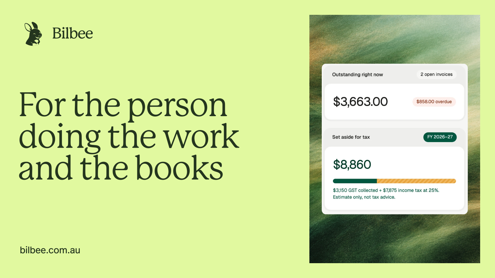
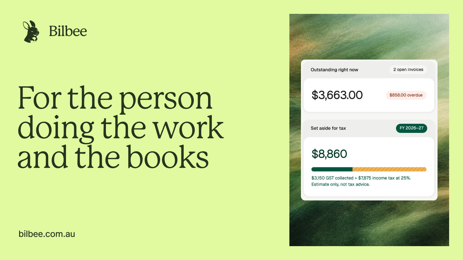
For the person
doing the work
and the books
Meet the whole family.
One kind of business, on purpose. Everything we make starts with the person doing the work and the books.
Bilbee is invoicing, expenses and tax for Australian sole traders. It turns your records into a running estimate of the year's tax, and a Simpler BAS worksheet if you're registered for GST. The estimate moves as you get paid, so you know roughly where you stand all year, not only once it's over.
More about BilbeeInvoicing that speaks
Australian tax
Lead with the fact, then the next step. Show the working and keep estimates labelled.
Speak to someone running a business, not a finance department. Be helpful, direct and never judgemental.
Bilbee prepares the figures. It doesn’t lodge a tax return, give tax advice or move money into a set-aside account.
Our signature is the bilby and the Bilbee wordmark. Use the supplied artwork, with its proportions and colours intact.
Primary lockup on light surfaces. Supplied reverse lockup on dark surfaces.

Keep clear space of at least half the mascot disc’s height on every side. The lockup is at least 24 px tall on screen. For larger placements, give it more room rather than making it fill the frame.
The logo is artwork, not typeset text. Don’t rebuild it with a font. On lime, use the supplied mascot and wordmark as separate elements.
Use the original files. Keep the disc circular, the lettering in proportion and the background quiet.
No stretching, tilting, shadows, outlines, new colours or busy photographs behind the logo.
Green is the thread. Forest gives us confidence, lime brings warmth, and ink keeps everything grounded.
Actions, links and a confident first impression.
A small, warm moment. Use with ink text.
Headlines, the wordmark and the deepest green.
Quiet backgrounds and supporting surfaces.
The marketing site’s reading surface.
Documents, cards and space for the details.
Select a hex value to copy it. Pale lime matches the original logo’s disc and is used for backgrounds and accents. Lime buttons retain the stronger original lime.
Give text plenty of contrast: ink on paper, ink on lime, white on forest. Use the wider palette to explain a status or a chart, rather than adding decoration.
A status always has a word as well as a colour. Lime is an accent, never body text on white.
P22 Mackinac Pro shapes the headlines. FF Real Headline Pro carries the reading, controls and figures.
Aa Bb Cc
FF Real Headline Pro · body and UI
ABCDEFGHIJKLMNOPQRSTUVWXYZ
abcdefghijklmnopqrstuvwxyz
0123456789 & $ % +
Aa
Aa
Aa
Book · sentence case · close spacing · room to breathe
P22 Mackinac Pro Book is for page and section headings. P22 Medium gives feature headings their shape. Illustration titles use P22 Medium at 24 px and −0.04em letter spacing. FF Real Headline Pro at weight 300 carries body copy, figures and supporting titles. Supporting titles are 24 px, or 20 px in compact cards, with −0.02em letter spacing. Weight 400 is for navigation, controls and emphasis. Both families use supplied font cuts, with browser-generated weight disabled. Page headings use 40–80 px with 0.95 line height and −0.035em letter spacing. Section headings use 30–56 px with 1.0 line height and −0.04em letter spacing. Keep long passages left aligned and let headings wrap at natural phrases.
Use Australian formats: $1,240.50, 14 Aug 2026 and FY 2026–27. The web app uses Geist for its interface. Keep that distinction when showing real product screens.
Font files are not included in the kit. Use your own appropriate font licence for new work.
A straight-talking Australian who has done this before. Calm about the paperwork, careful about the money.
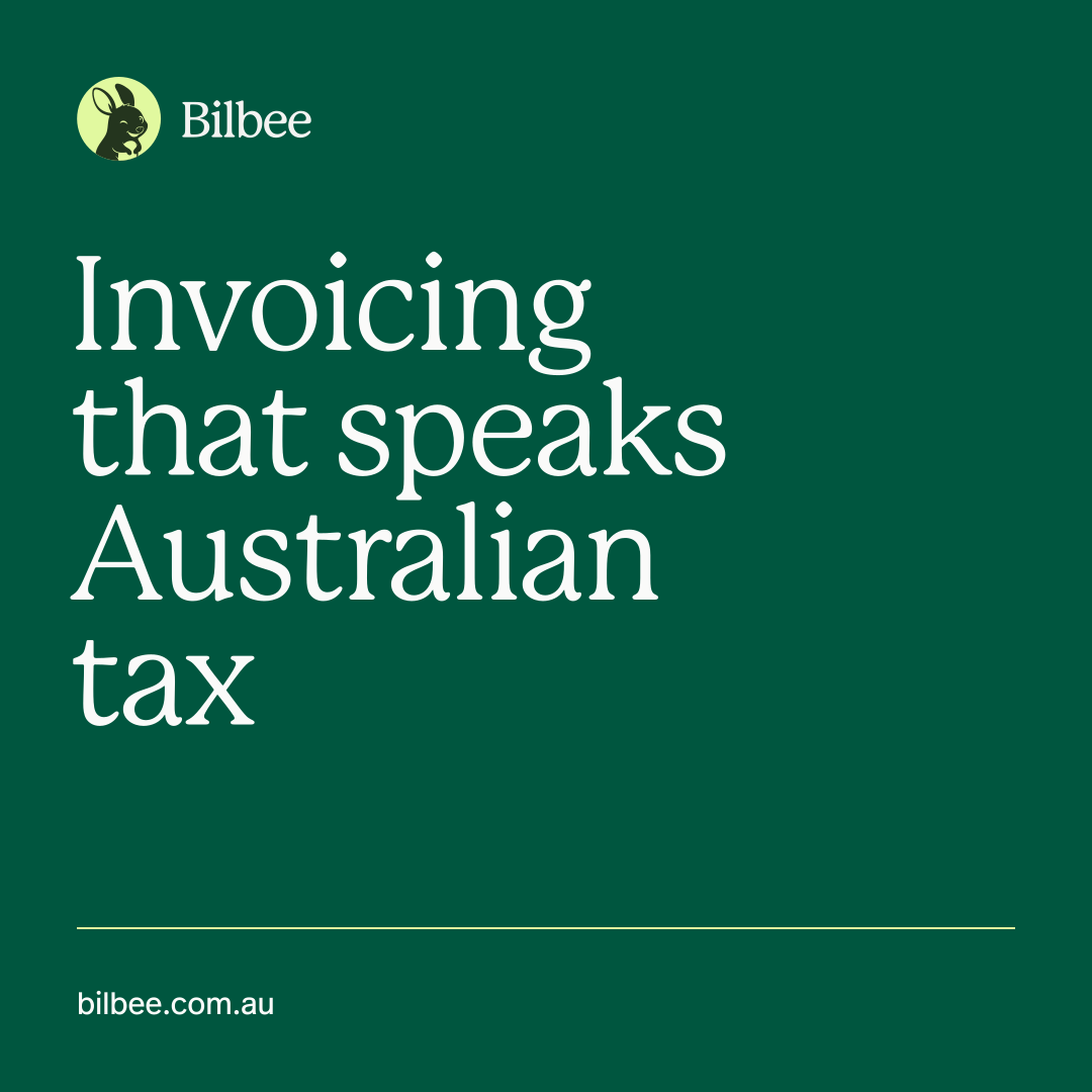
Invoicing that speaks Australian tax
Say what Bilbee does, in words a sole trader already uses.
No invoices yet. Send your first one and Bilbee starts tracking what you’re owed.
Explain what happens next. Give the action a verb.
That ABN needs 11 digits.
Describe the fix. Never blame the person or dress an error up as a joke.
Estimates show their working
Keep “estimate” visible. Never turn a calculation into a promise or tax advice.
“Your tax estimate” is a useful description. “Your tax is sorted” can promise more than the product does. Say what the figures cover, show the working and leave tax advice to a registered tax agent.
A small Australian character with a useful job: to bring warmth to the moments that deserve it.
The bilby belongs in a welcome or a carefully chosen brand moment. Keep warnings and financial amounts plain. The illustrated 404 burrow is our one playful recovery moment.
Download the mascot32 px48 px80 pxThe same artwork at every size.
Let the expression do the work.
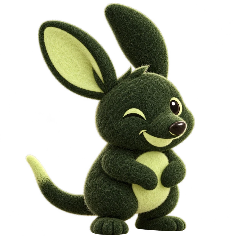
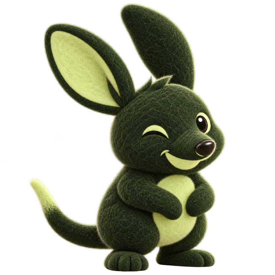
Keep the supplied drawing, expression and disc together. The felt characters below are a separate illustration family; they don’t replace or alter the core mark.
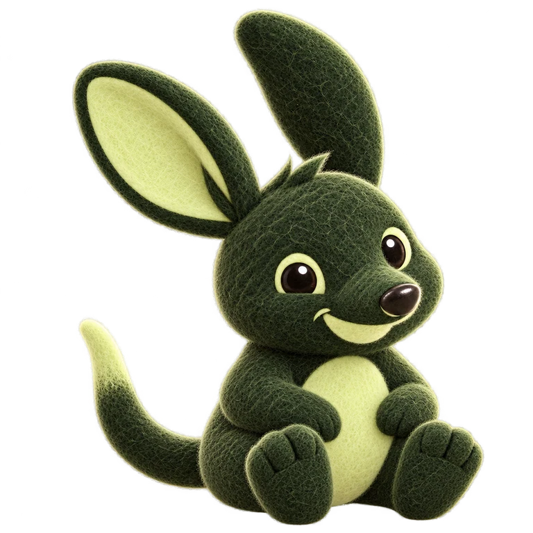
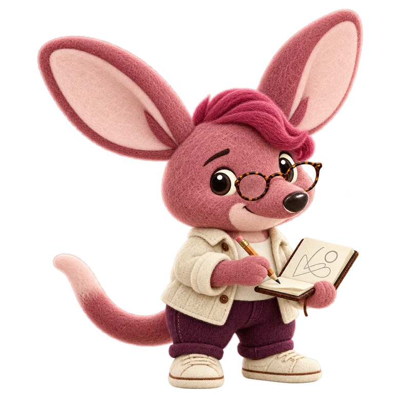
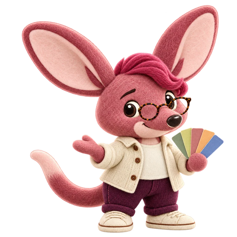
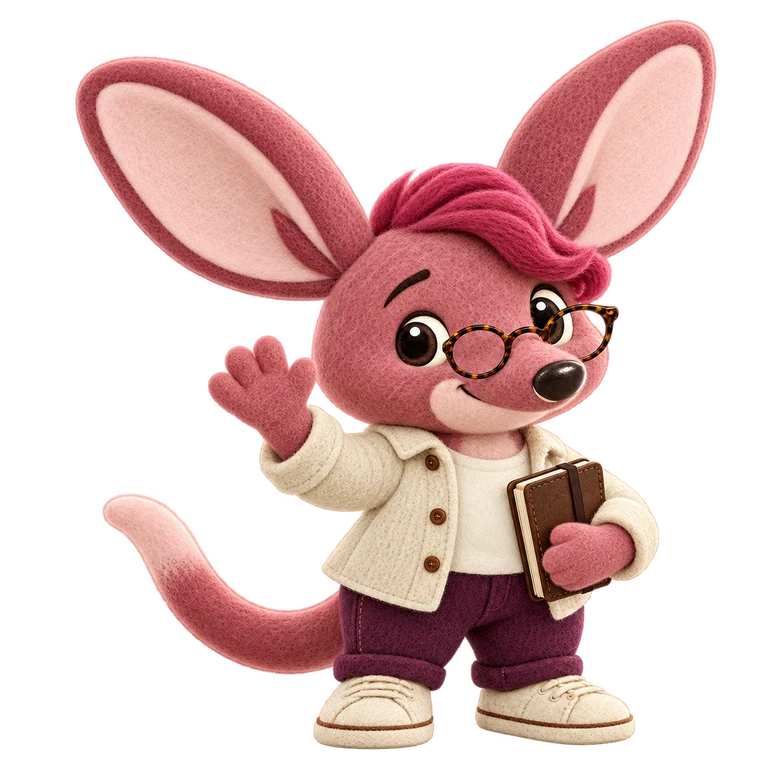
Five familiar faces for different kinds of working day. Bilbee leads the family, with a character for the people we’re here for.
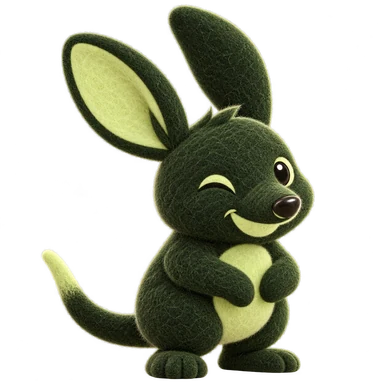
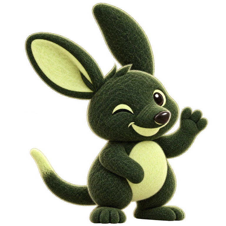
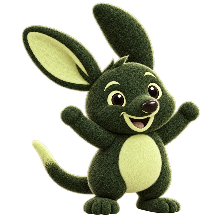
The familiar face of the brand. Warm, reassuring and ready to help with the books.

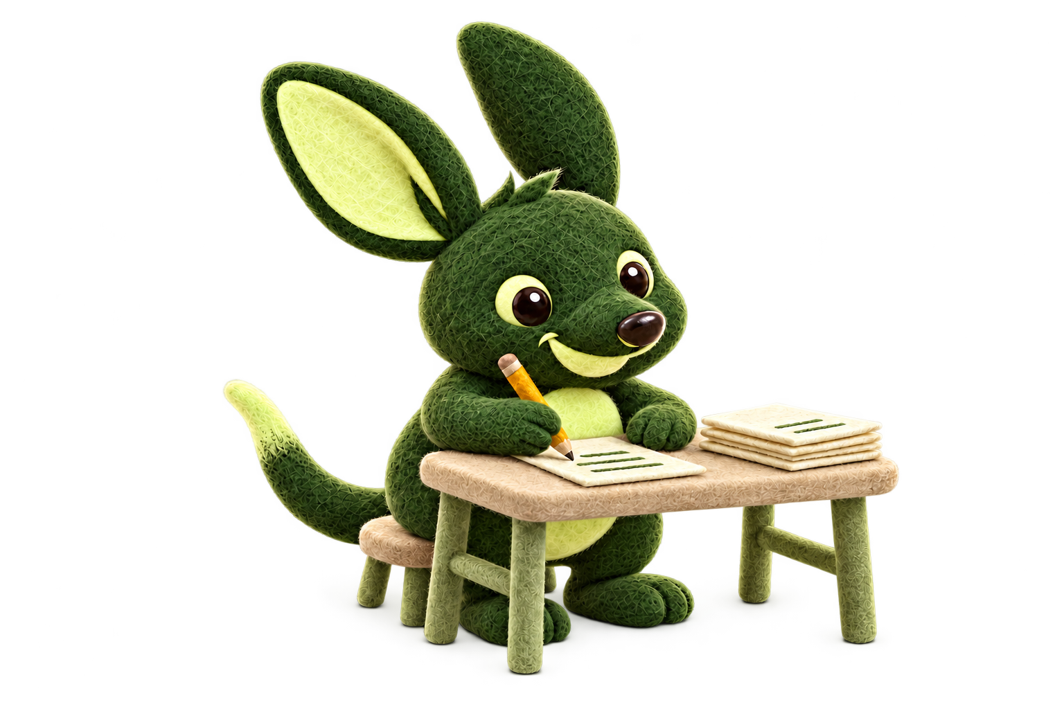
Practical, confident and ready to get stuck in. From the first quote to the next job.
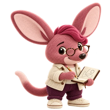
Curious and thoughtful, with a sketchbook full of ideas. A familiar face for creative work.

Quiet focus, patient problem-solving and the occasional well-earned celebration.

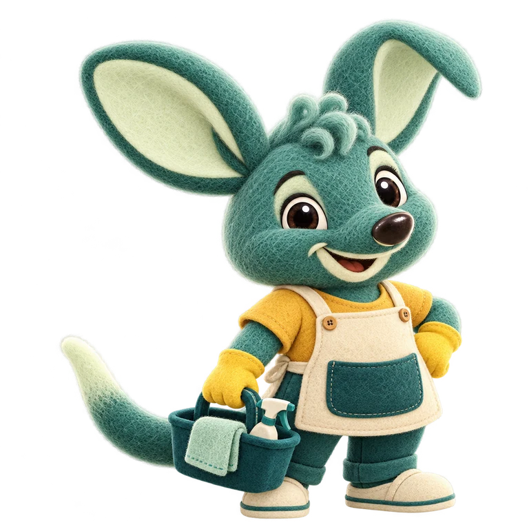
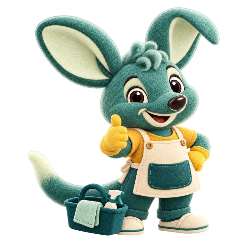
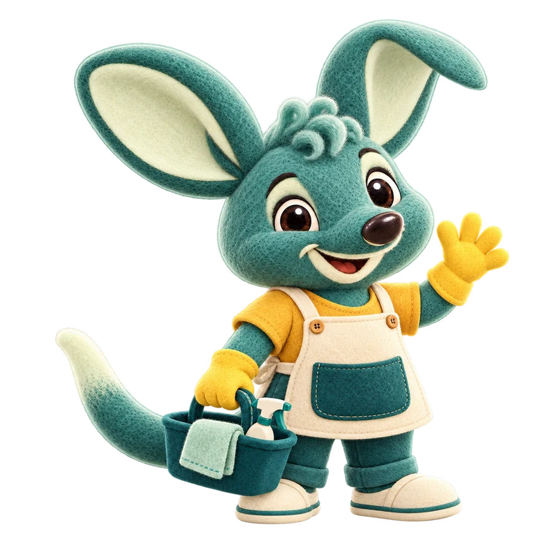
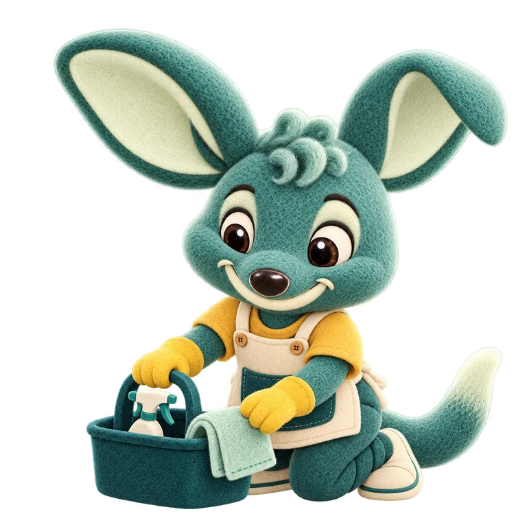
Care in the work, pride in the finish. A warm presence for the regular visit.
Bilbee is our main character. The tradie, designer, developer and cleaner bring their own colour, expression, hair, ears and working kit. Choose the person who belongs in the story.
Keep their felt texture, proportions and supplied colours intact. Expressions can change with the moment. They don’t always need to wink.
Explore every approved poseUse a character where a person would welcome, explain or encourage. Give them space and a clear purpose.
Choose one character or scene per marketing page. Keep the product, the message and the next action easy to find.
All 30 poses, together. Six for each character, from a simple hello to getting the job done. Choose the expression and action that fit the moment.
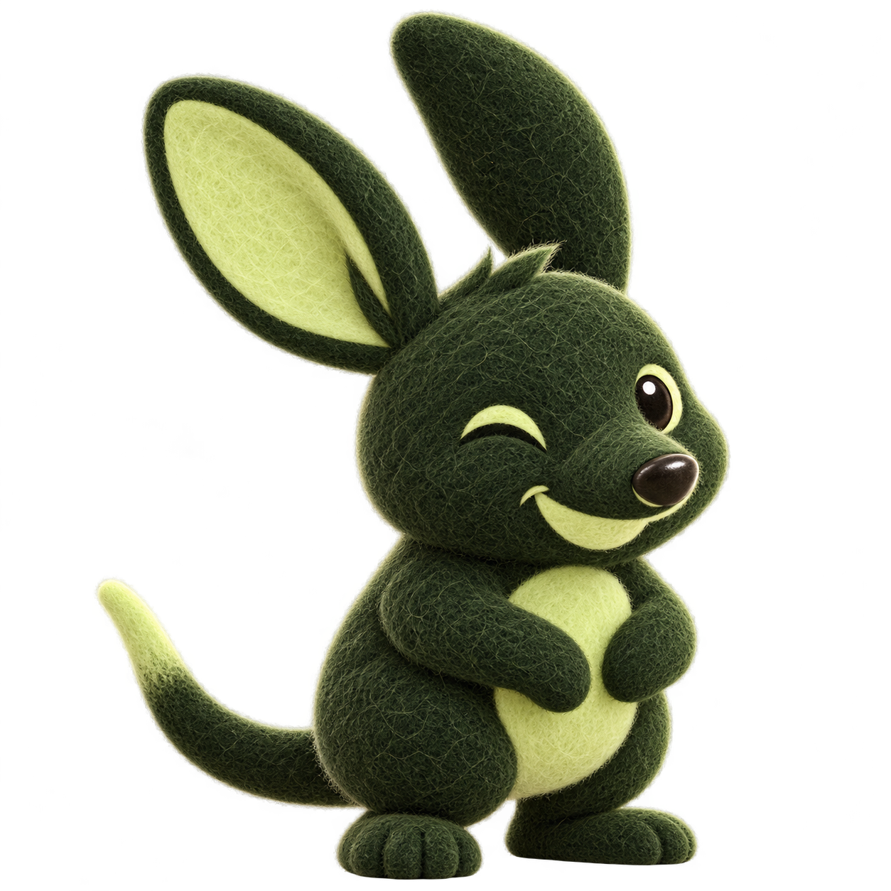


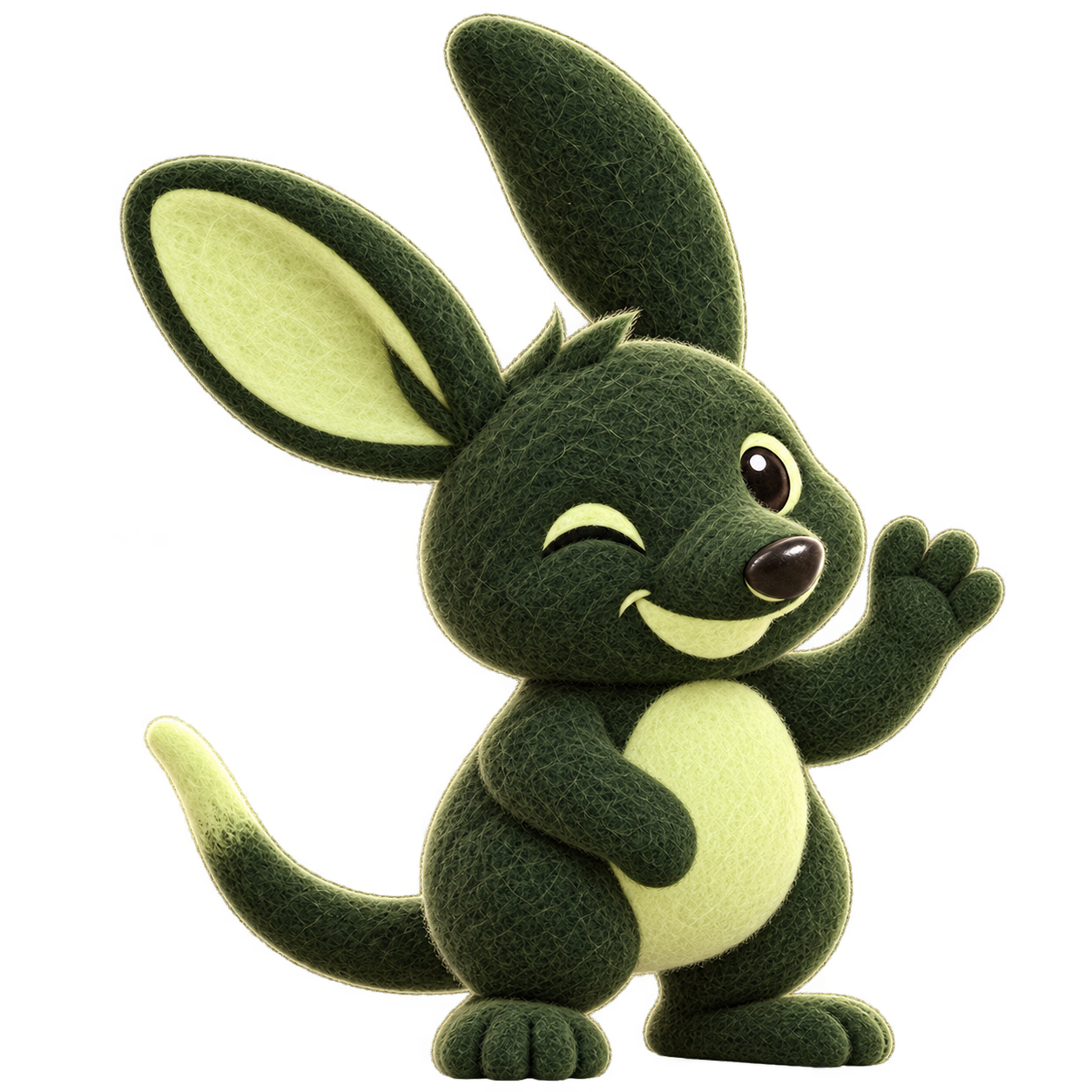
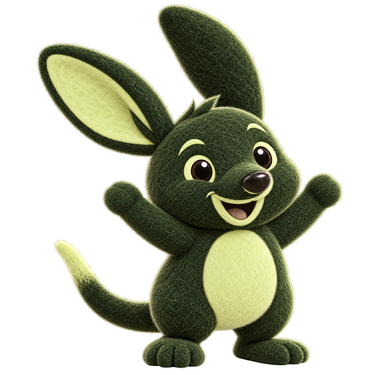
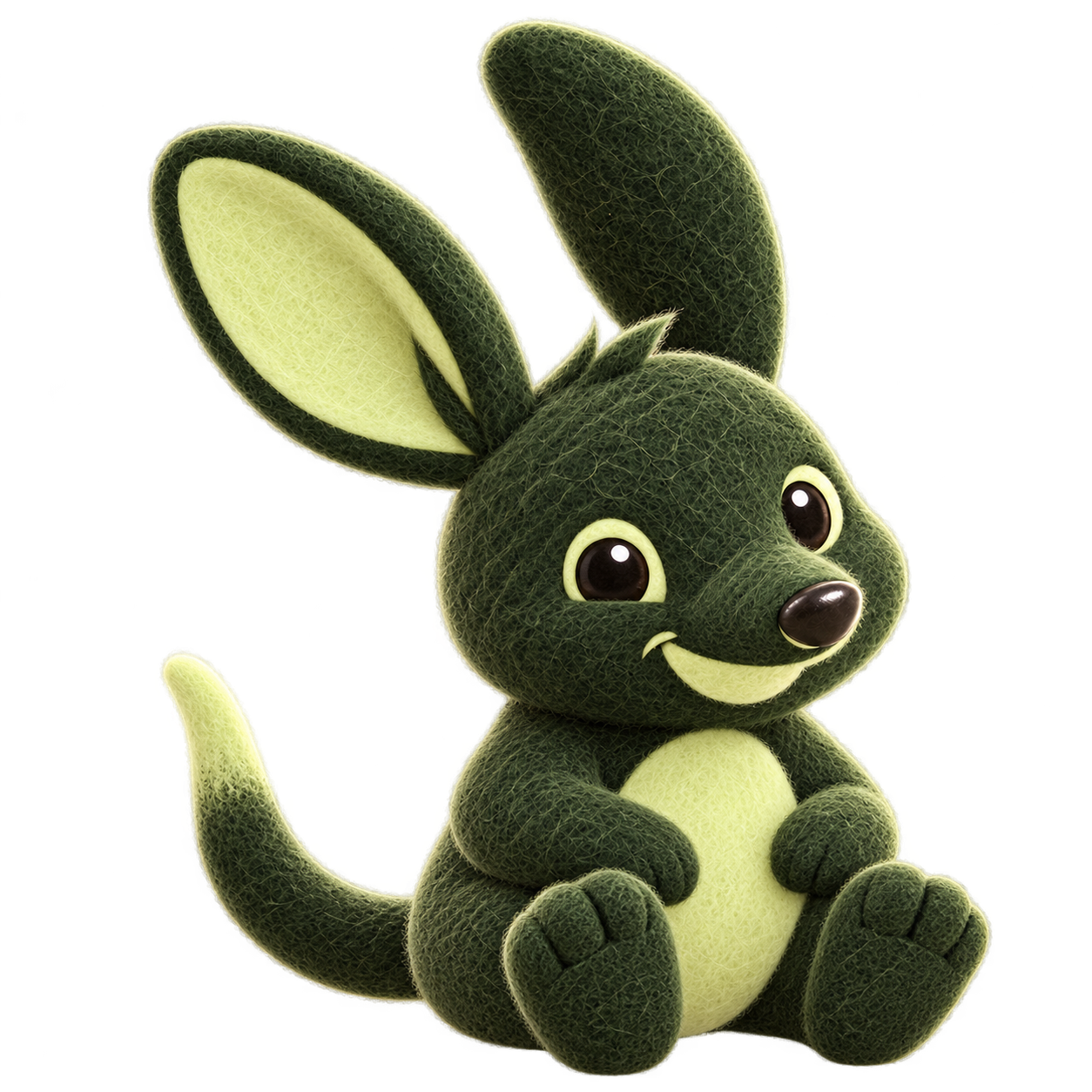






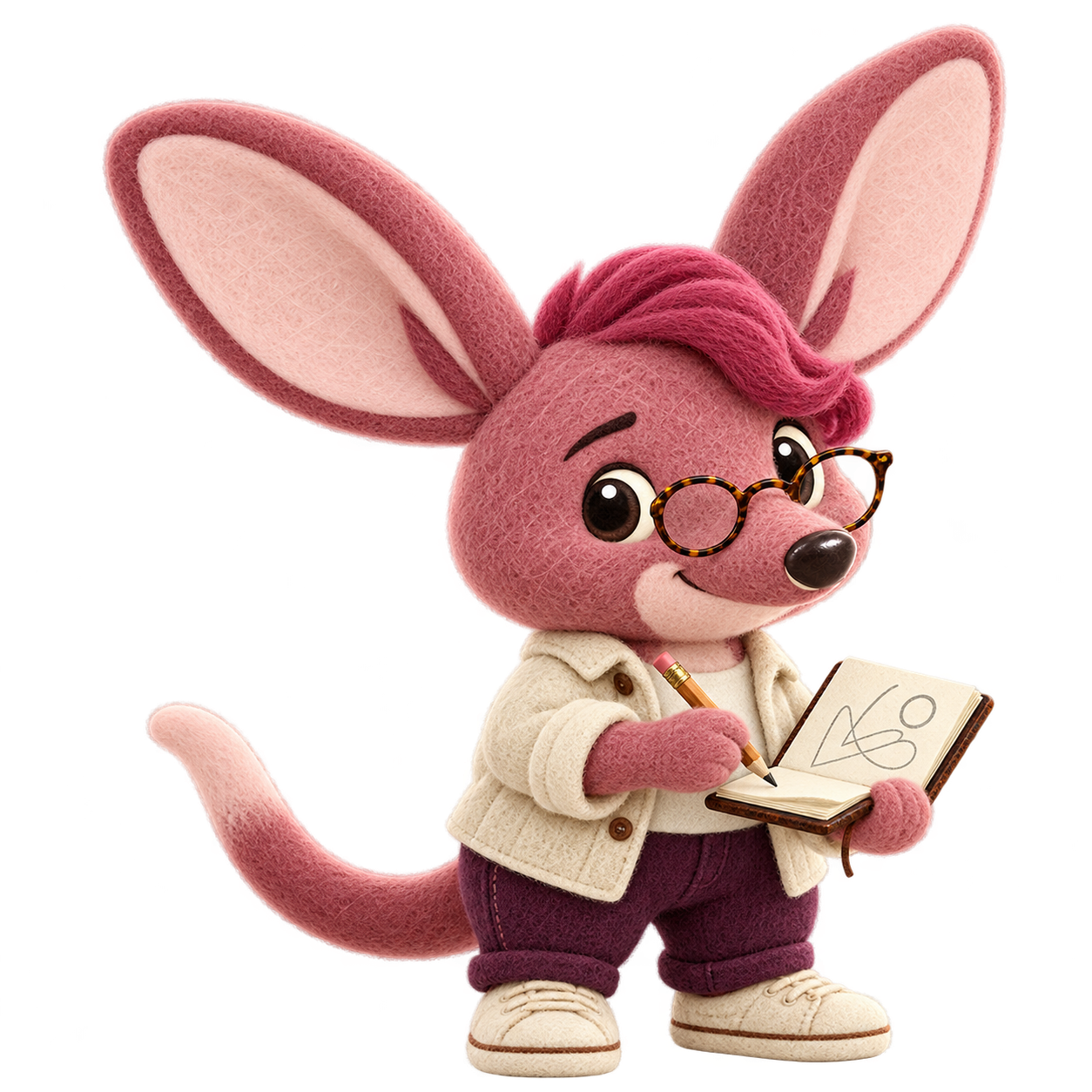
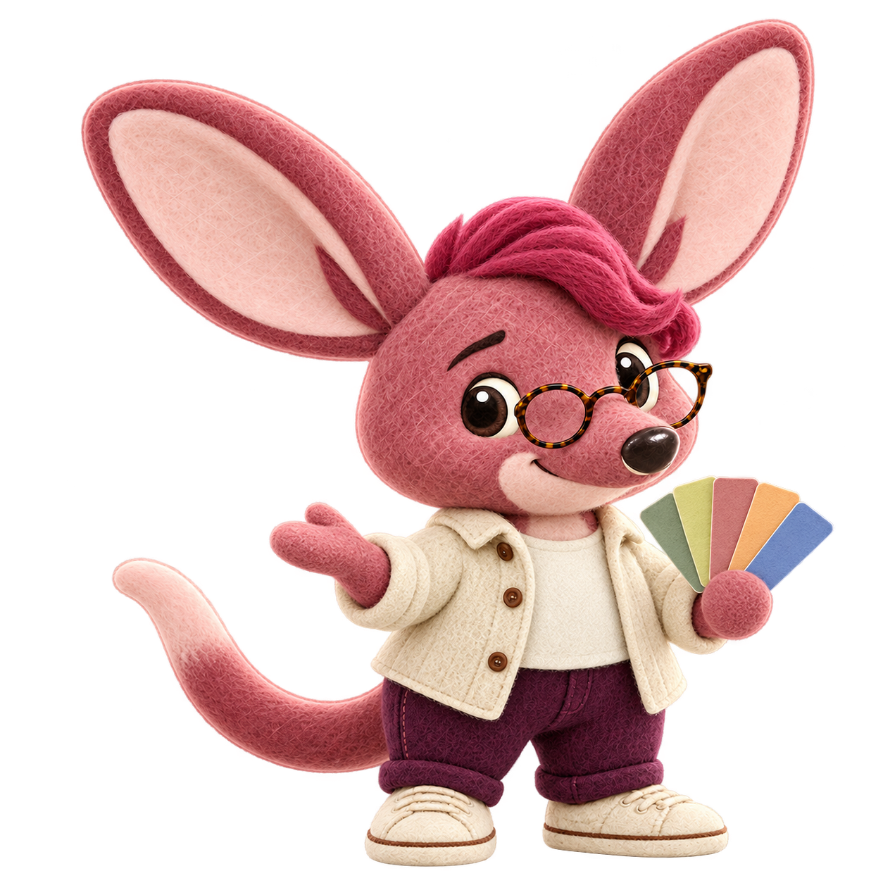

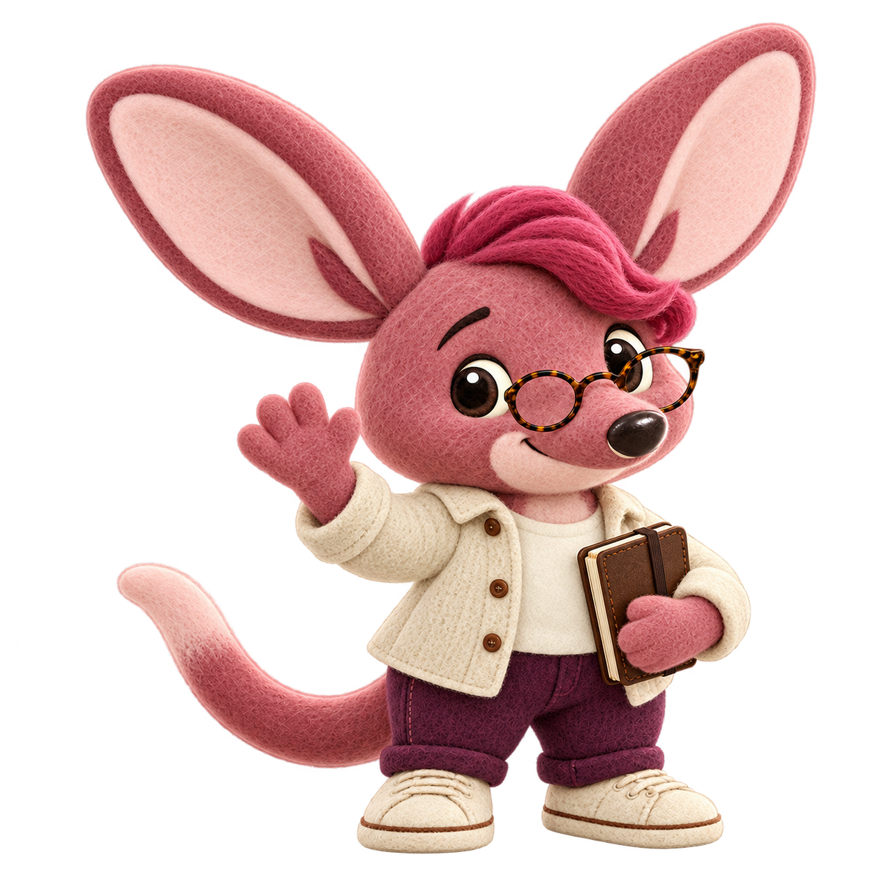








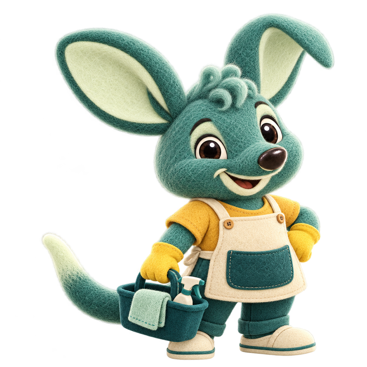

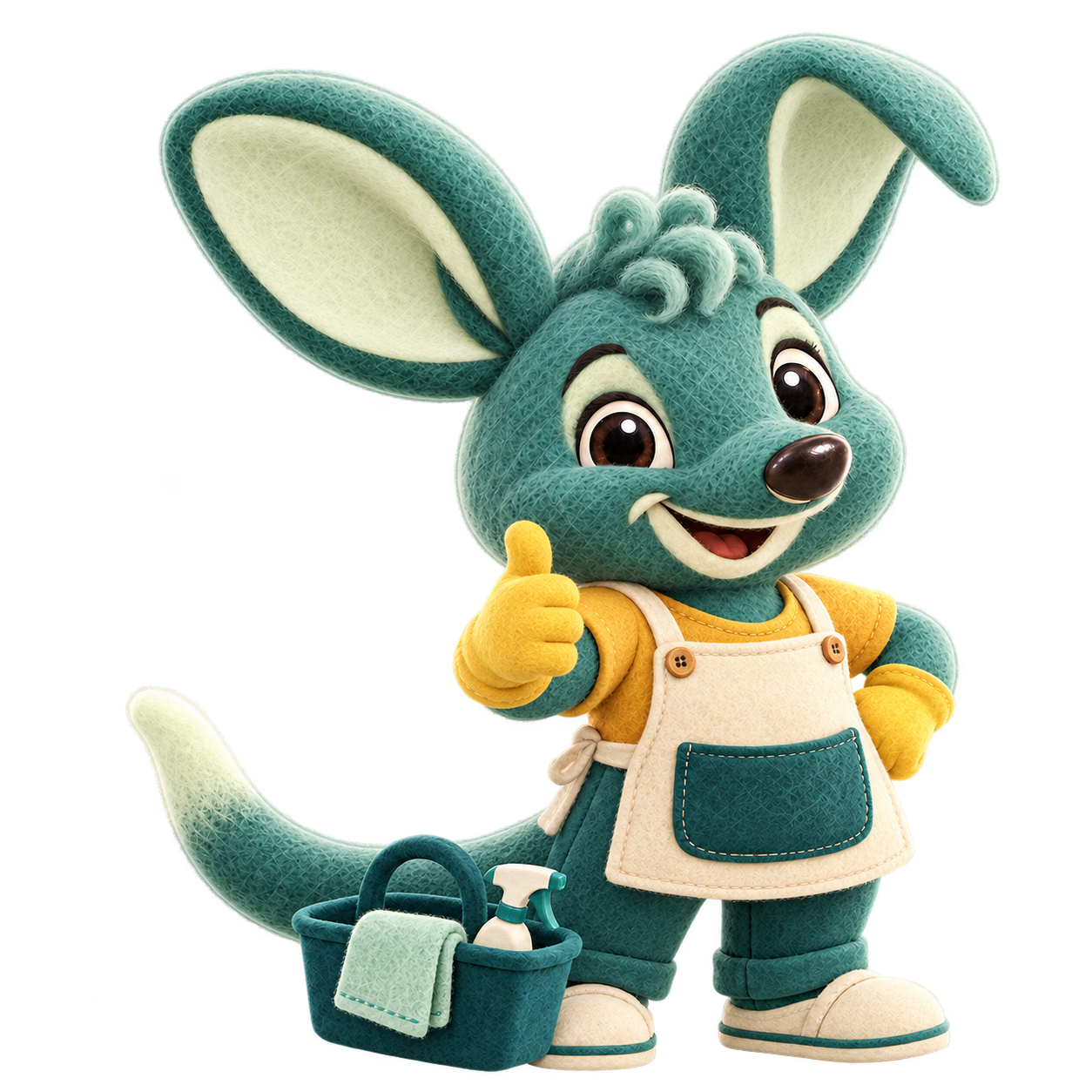
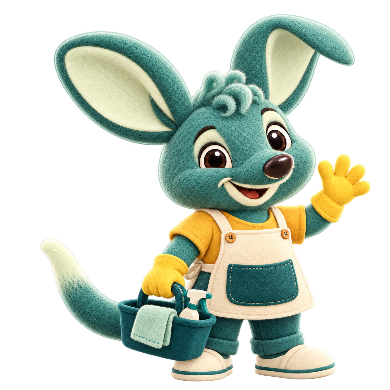

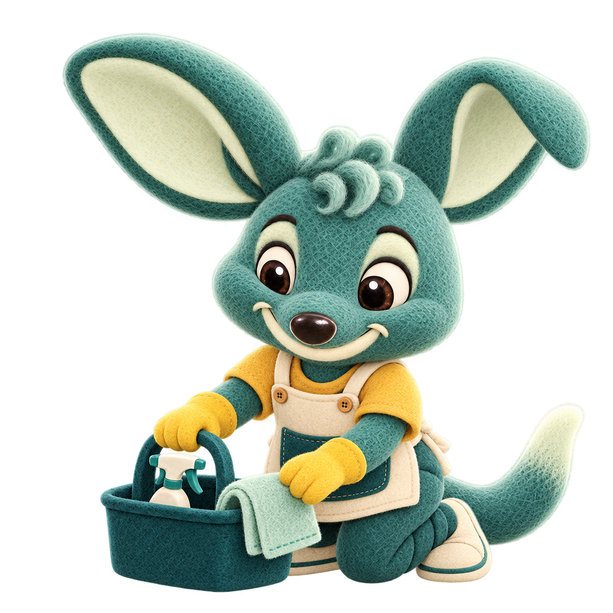
PNG downloads are the original transparent masters. WebP downloads are 768 px exports. Mirroring changes the preview only.
Point towards an explanation. Wave in a welcome. Use the tools when the story is about the work. Save a celebration for something that has actually happened.
A horizontal flip can help a character face the content. Check any writing or directional props first, and remember that ears, hair and accessories will also swap sides. Keep the logo in its original direction.
A little more of their world. Felt characters in softly printed settings, each connected to a real story on the website.
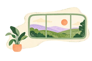
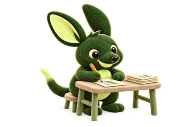
A small, orderly desk makes keeping the books feel like an achievable routine. The existing product preview still explains the EOFY pack.
Your records, ready to shareHomepageKeep the books together through the year. Give your accountant read-only access or download an EOFY pack for the next conversation.


The clipboard has a reason to be here: the tradie is working out the scope on site before sending a quote.
Before the job startsTradies and subcontractorsSend a quote for approval and raise a deposit invoice from it.
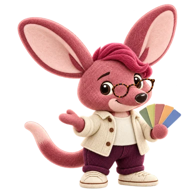
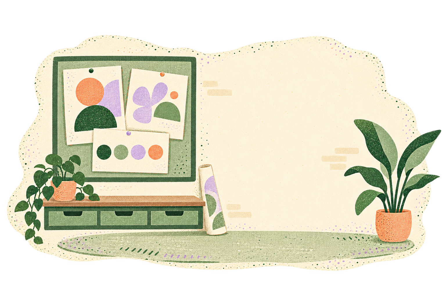
The colour swatches and finished studio proofs show the moment before the final invoice. It connects the admin to the creative work it pays for.
The work is deliveredFreelancers and creativesSend the final invoice and give your client a simple way to pay.

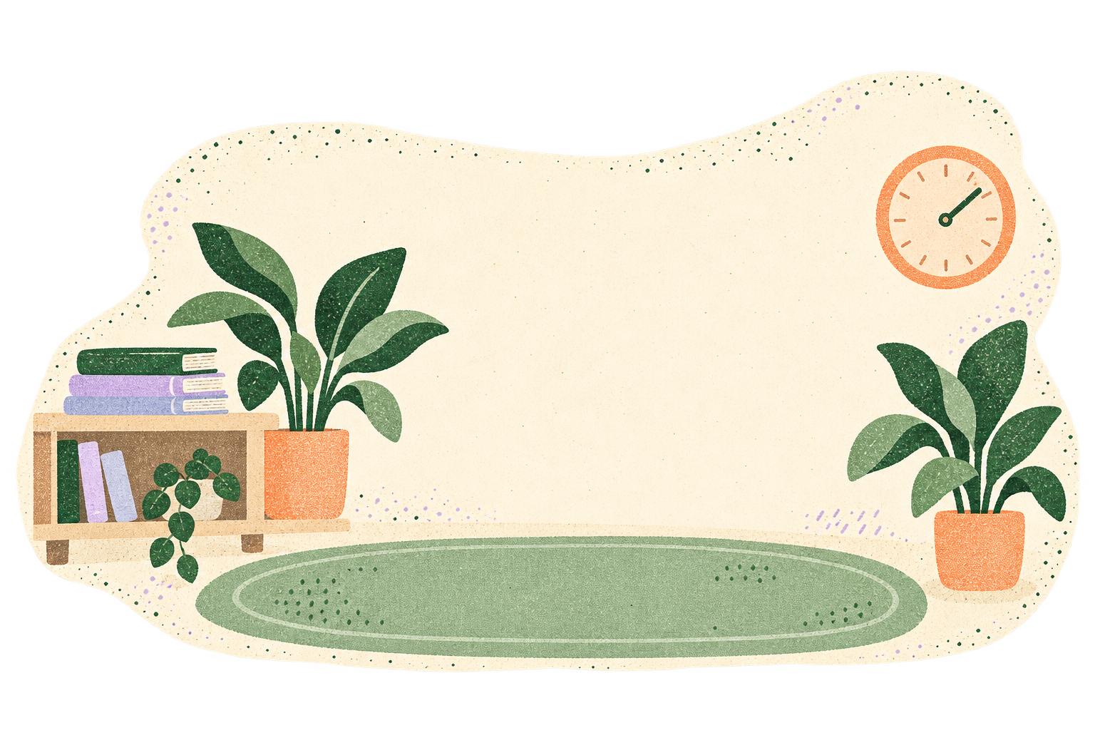
A focused laptop pose and a simple wall clock connect the work to billable time. The separate product example explains the timer and timesheet.
A week across several clientsConsultants and IT professionalsRecord time against the right client before the small tasks slip your mind.
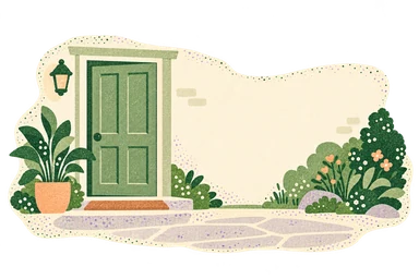

A familiar doorway and warm greeting make repeat work recognisable. The story is about the relationship and the recurring paperwork around it.
The same clients each fortnightCleaners and gardenersReuse their details and set up recurring invoices for regular work.
The character stays tactile and felt. The setting is flatter: risograph grain, simple shapes and familiar lilac, apricot, sage and cream. It gives the work a place to happen.
Use the transparent edges to blend gently into a quiet surface. Keep the full composition visible, with room around it. Avoid hard crops, extra shadows or a scene behind body copy.
These are five scene options for the website stories shown above. A scene replaces the page’s existing character moment. Product previews still explain the product.
Download all five scenesUseful objects, familiar colours and room for the next step. Eleven everyday empty states, two occasional welcomes and our 404 burrow.
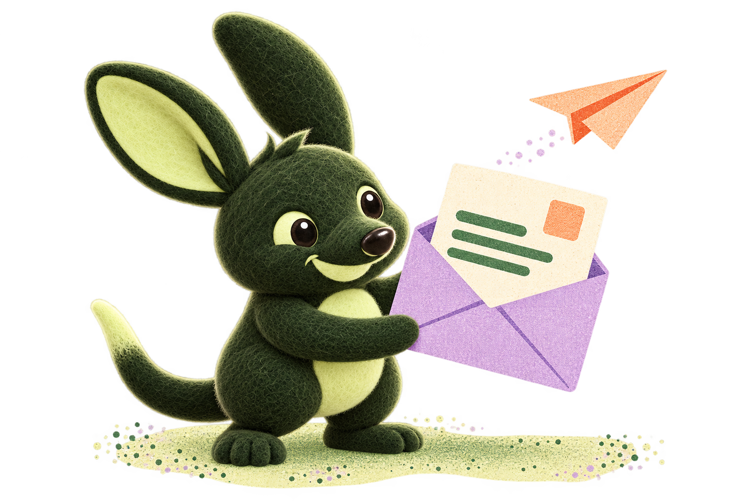
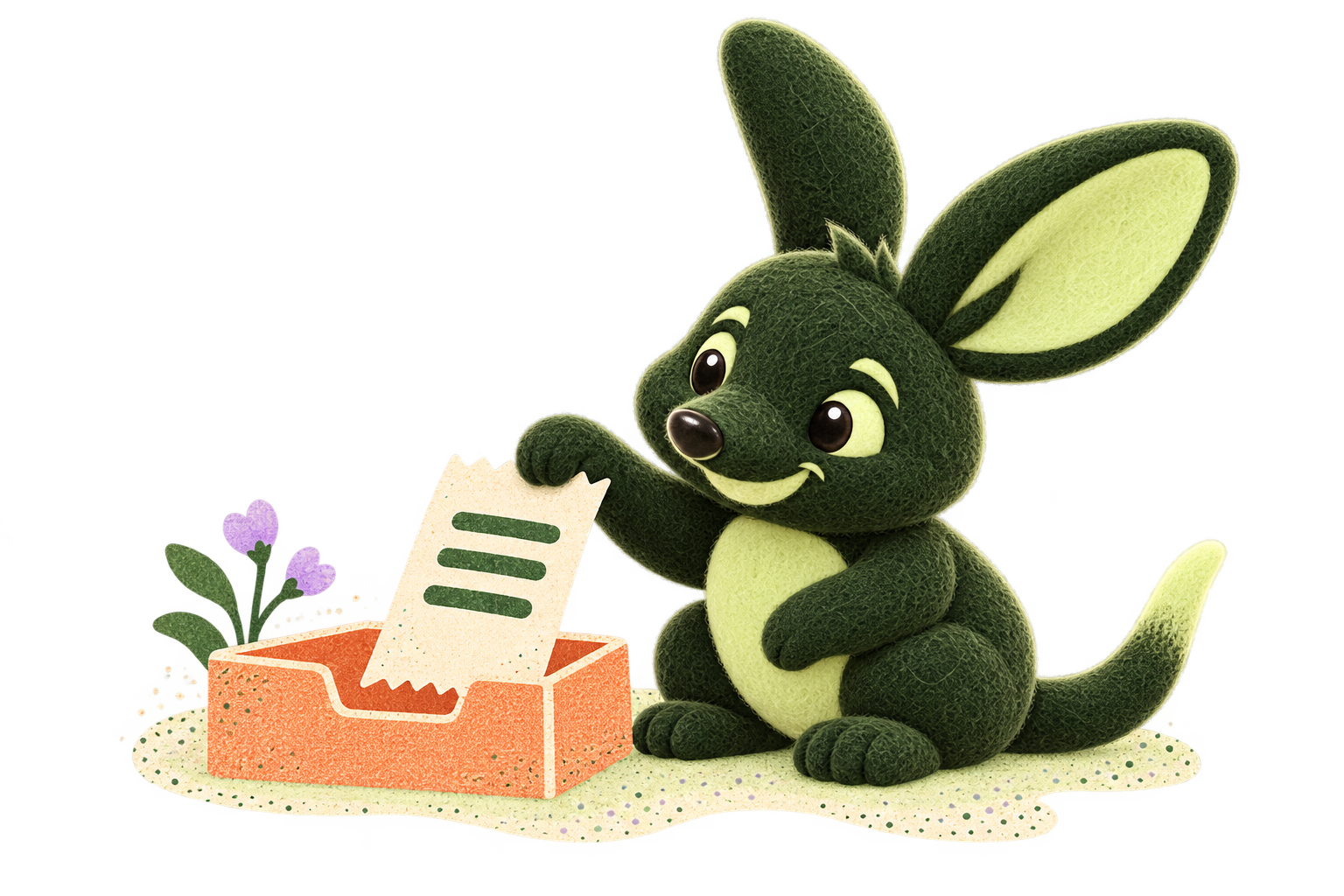
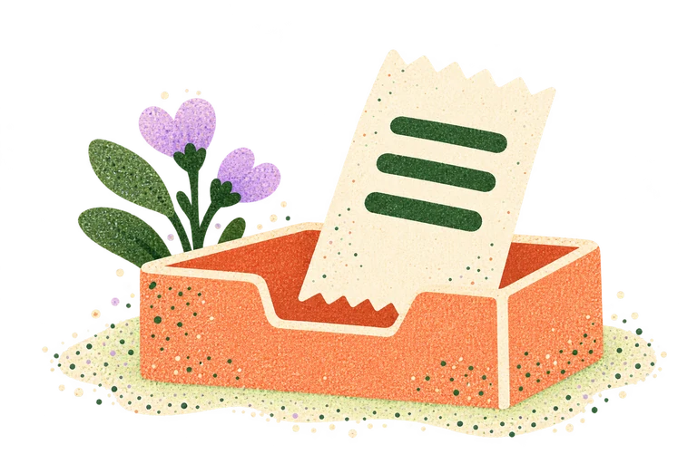
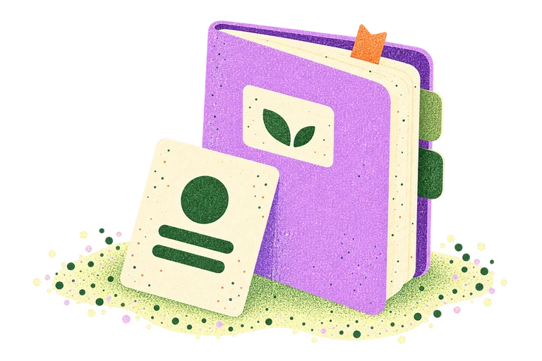
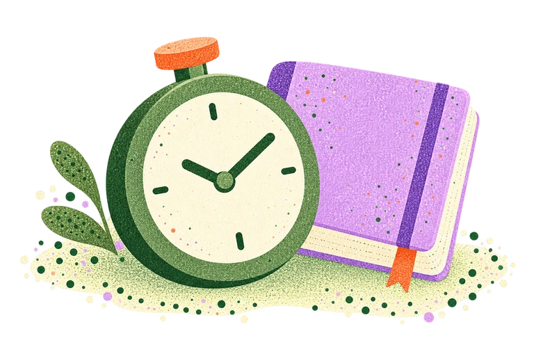
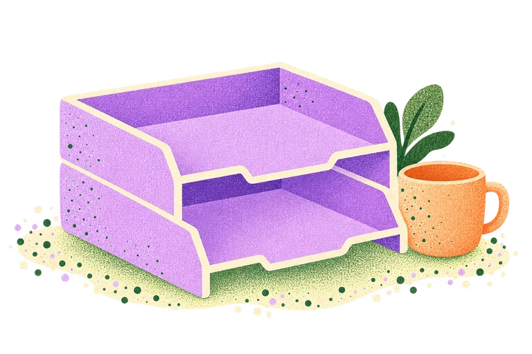
An envelope, a folder, a notebook. Familiar objects make an empty space feel ready for the next step. This is the default app illustration family.
Use the familiar palette and soft risograph texture. Keep the headline, explanation and buttons as real interface elements beneath the art.

Empty invoice lists, including the compact Recent invoices panel and a client’s invoices.
The empty expense list. Keep the selected financial year in the accompanying message.

Before the first quote. Keep the next step close to the illustration.
Before the first client. Keep both adding a client and importing a list available.

Before the first time entry, when a client exists. Individual empty days stay plain.
The document library and the compact Documents panel on a client’s page.
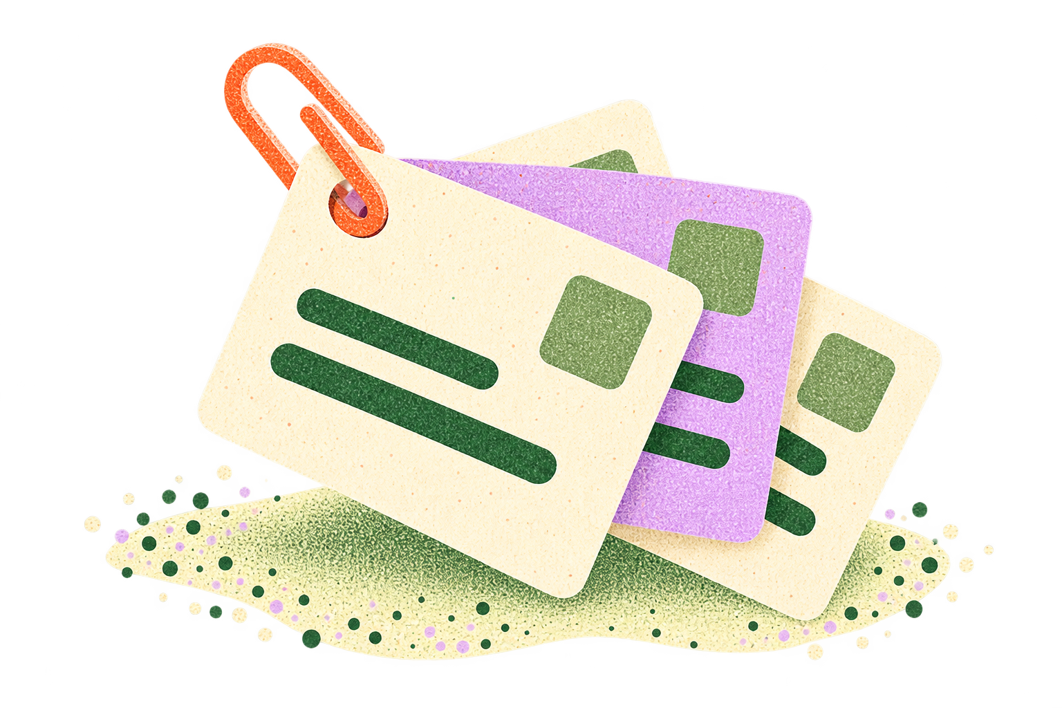
Before the first saved invoice item. These are reusable services, not physical stock.

Before the first recurring template. Schedule problems and warnings stay plain.
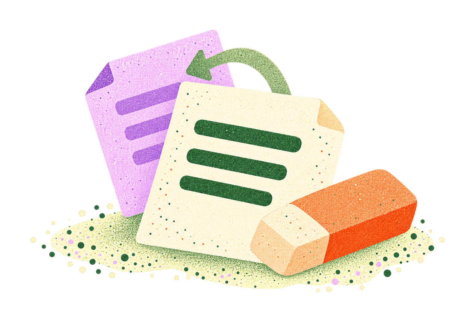
The empty credit-note list. Explain that a credit note starts from an invoice.

The accountant’s empty client-books list, when no invitation is waiting.
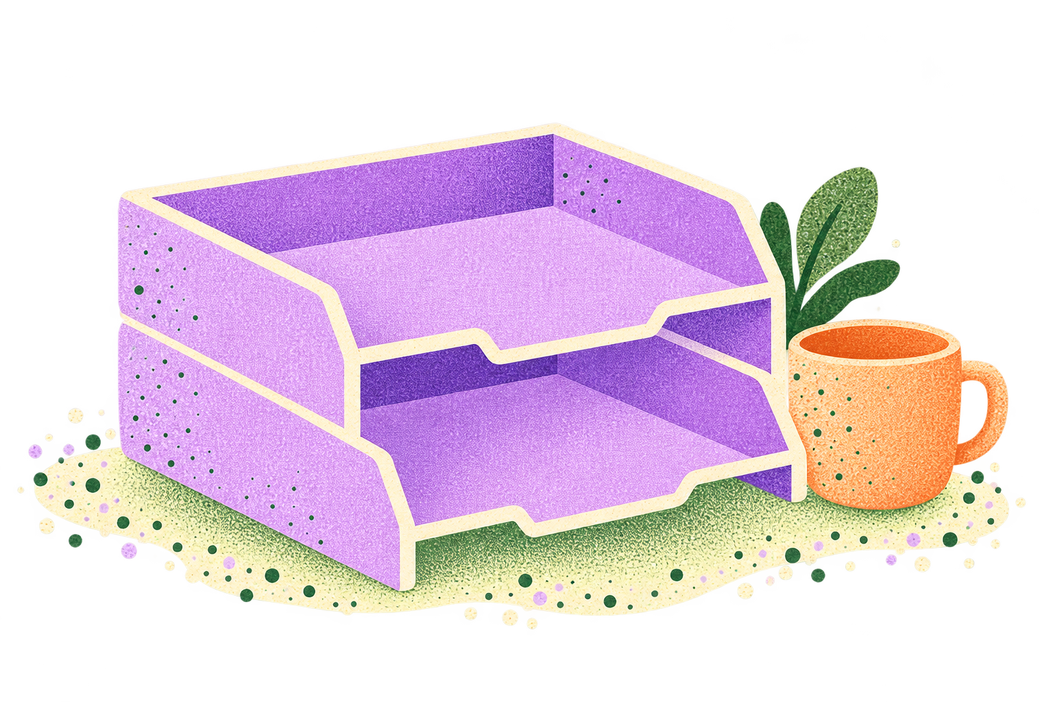
An empty bank match queue. An empty queue alone does not mean the books are complete.
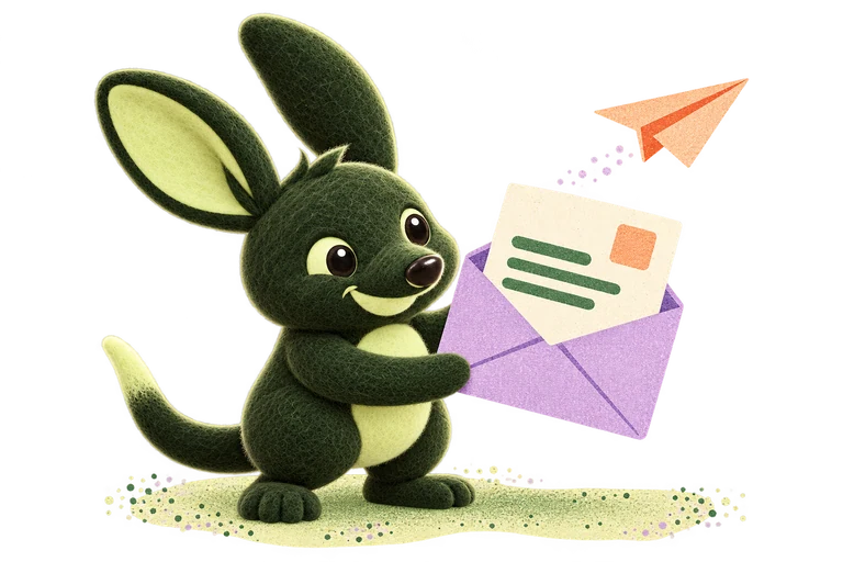
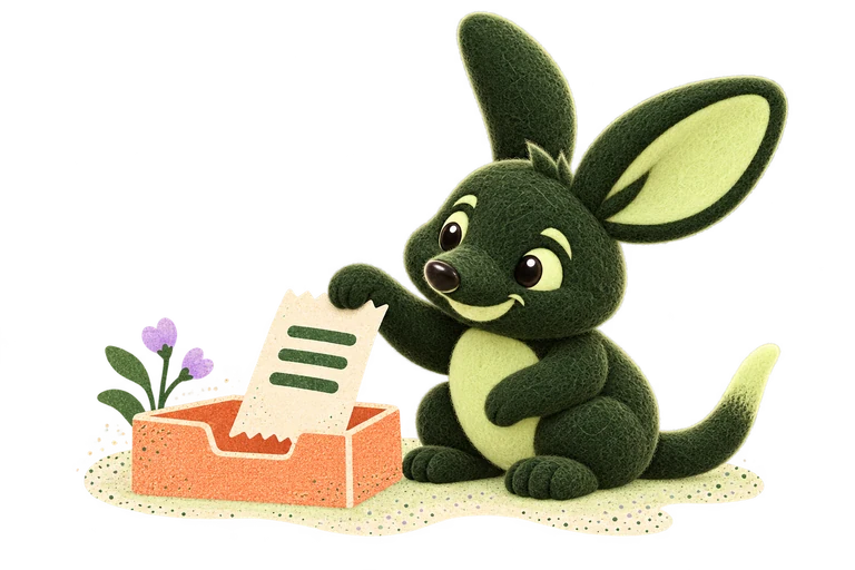
These two Bilbee variants are for a deliberate welcome moment. Use one when a little company helps, with object-led illustrations doing the everyday work elsewhere.
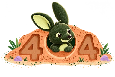
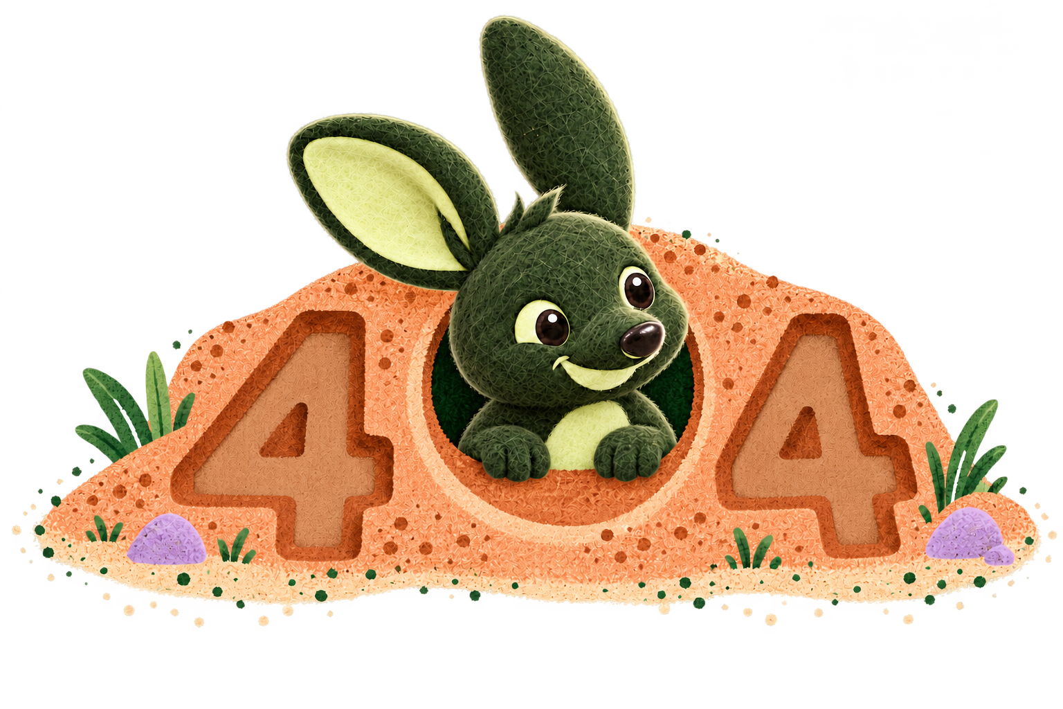
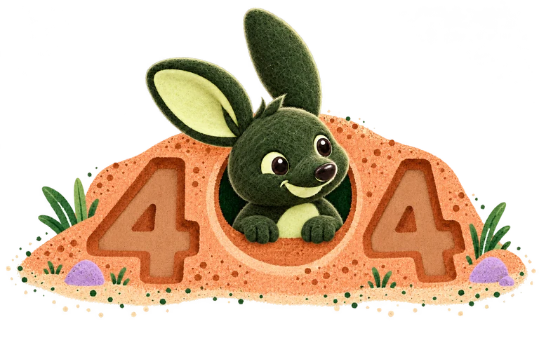
The burrow makes the zero. Bilbee peeks out between two medium-clay 4s. This is the current 404 artwork for both the website and apps.
Keep the whole mound visible and the route back clear. Use this for a missing page; other errors and warnings stay plain.
Use around 200–240 px for a full-page app empty state and 144 px for a compact web panel, such as Recent invoices or a client’s Documents. Keep the proportions and transparent edges intact.
Use plain guidance for filtered results, warnings, plan restrictions and financial information. Treat the illustration as decorative when the nearby text already explains the state.
Useful shapes, generous space and familiar symbols. The details should make the work easier to read.
A home for the bilby.
Buttons and small labels.
Documents and surfaces.
Lucide icons, with a consistent 2 px stroke. Use 16 px in compact rows, 18–20 px in buttons and larger sizes when there is room. Always pair an unfamiliar symbol with a label.
Keep related things close and give new ideas a little room. Use the shared 4 px spacing grid. Keep content surfaces softly squared and controls rounded.
Shadows are subtle and tinted with ink. Hover states darken. Don’t use coloured left borders to make a card stand out.
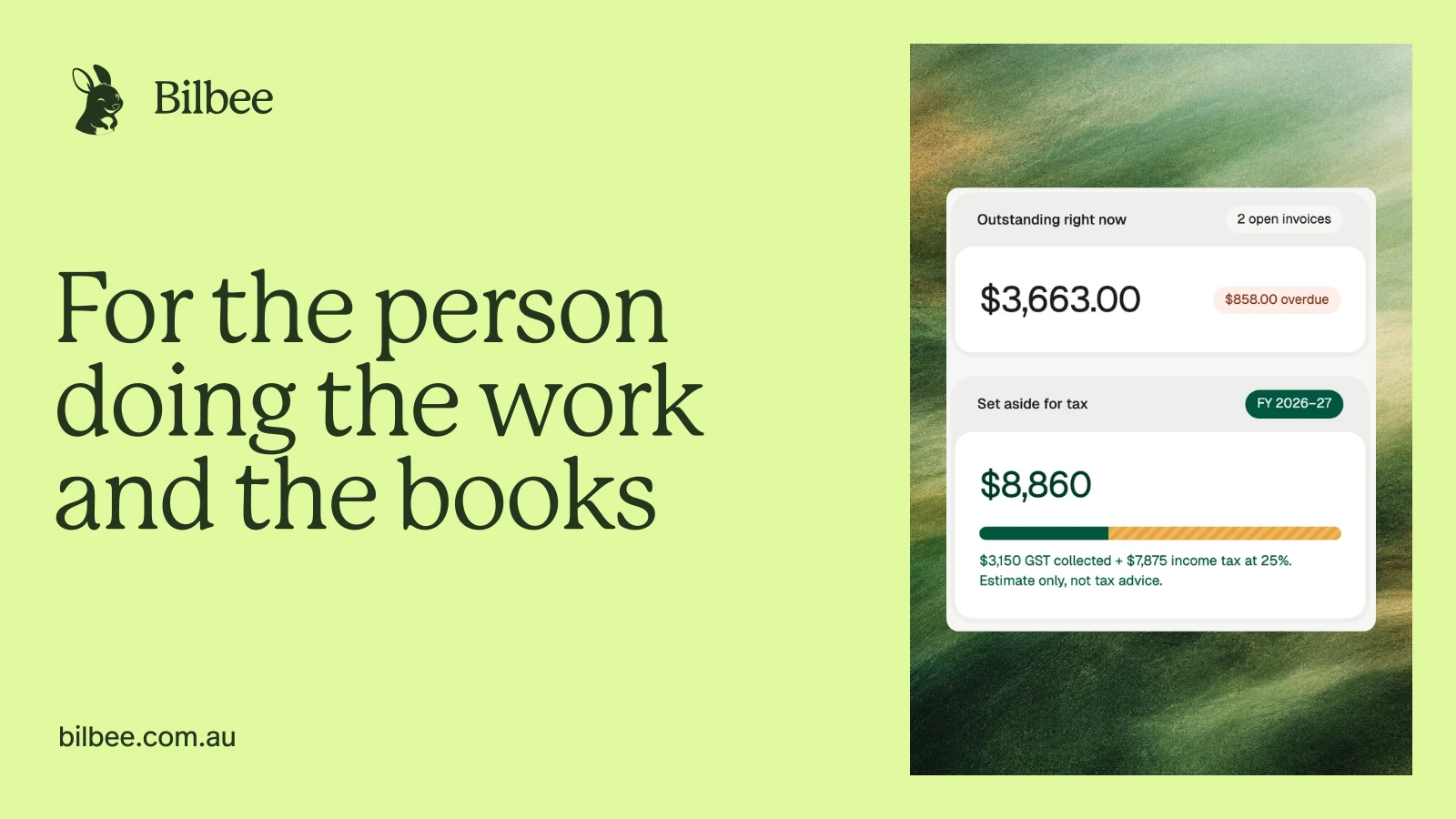
A backdrop for the product. Use abstract artwork only behind an overlaid screen, mockup or workflow illustration. Never use it as a standalone decorative image.




















The images above are source backgrounds to choose from. In a finished layout, a product screen, mockup or workflow illustration always sits over the artwork. A headline beside the artwork on its own is not enough.
Keep the screen readable and detailed text on an opaque surface. Green stays dominant, with cream and light sage keeping the background open. Keep ordinary surfaces flat. The shared dark green treatment and the website’s closing gradient are the exceptions.
Show Bilbee as it is. Real screens, readable details and no promises hidden in a mock-up.
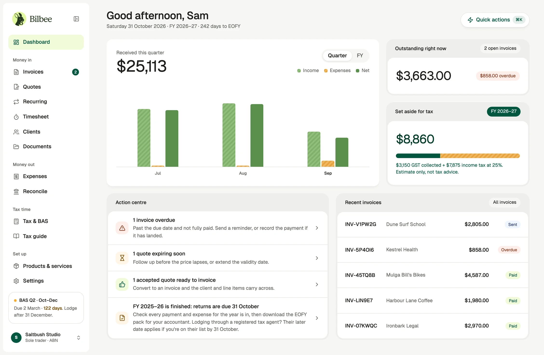
Use current product screens. Keep the labels, amounts and estimate wording legible. When preparing a new screenshot, use demonstration data and remove personal or client details before sharing it.
Marketing illustrations can explain a workflow, but they must not add controls, integrations or results that the product doesn’t have.
See the product in contextSmall movements should help you understand what changed. They never need to compete with the work.
Small changes of state
A little movement. A clear result.
Panels and larger changes
Give the content time to settle.Use the shared ease-out curve. The bouncy curve is reserved for the mascot and small success moments. Respect the system’s reduced-motion preference.
The website’s dither artwork follows reduced-motion settings and stops when the page is hidden. Keep content readable before, during and after any effect.
The same identity, put to work. These new layouts use the existing wordmark, colours and approved headlines.
The core identity and the full artwork library. Choose a pack, or download individual images from the chapters above.
The core brand kit: logos, the original mascot, social layouts, a profile image, colour files and a quick usage guide. SVG and PNG, with no font files.
Original PNGs, with a usage guide in each pack. Characters and risograph illustrations retain their transparency.
6 original transparent PNGs
6 original transparent PNGs
6 original transparent PNGs
6 original transparent PNGs
6 original transparent PNGs
5 scenes · separate character and background layers
Invoices, expenses, quotes, recurring invoices and credit notes
Clients, time, documents, saved items, client books and bank matching
2 occasional Bilbee welcomes and the latest burrow illustration
5 green-and-gold homepage backgrounds
Blue current, soft rose, coral accent, blue arc, rose ribbon and coral fold
Berry haze, sky weave, peach drift, lime tide, silver mist and rust current
Characters, mirroring, scenes, empty states, the 404 and abstract backgrounds
The essentials for your next piece of work
Use these assets to identify Bilbee accurately. Keep the supplied artwork intact and don’t imply an endorsement or partnership that hasn’t been agreed. For a use that isn’t covered here, get in touch.